Friday, 10 December 2010

Film Poster Draft..

From our film poster research we concluded that there are some conventions of film posters that we have to abide by, these include:-

- having the date of release at the bottom
- putting the billing block at the bottom
- having the actors names is at the top
- the film title to be either in the middle or at the bottom
- a possible tag line near the title


This is our initial idea of our poster. We decided to place the main characters on a bench as this is a pose that the audience could relate to in a romantic comedy film. We would use a photo to create this image, whereas we could have drawn or computerised it. We kept the typical convention of having the billing block and the date of release at the bottom of the page as these are seen as less important. We also decided as a group to have a tag line that represents our film and gives the audience an insight of what could happen throughout the film, we decided to put this at the top to make it eye-catching and not draw too much attention from the film title. We couldn't decide the best place to put the title as we wanted to make it eye-catching and impacting, so we chose the middle.


This is our latest design. We have kept the billing block and date of release in the same as this is generally the place the audience will first look for that information. This information is also not as important as the film title and actors/actresses names. We have also kept the same image as before as it shows the genre of the film very well. We decided to add the actors names at the top of the page as this makes our poster look more professional. We had to move the tag line to underneath the image and title, I feel this was a better idea as it doesn't pull the attention away from the image and title. We decided to put the title next to the characters and try to create an effect of it 'sitting' next to them on the bench. We will use bright colours like pinks, purples and oranges and these are romantic, cheerful colours. We will try to portray this in what the characters are wearing as well as the writing. I think a white background would work best as this is typical of romantic comedy posters, such as Bridget Jones and Slumdog Millionaire.

Magazine Research..

For our coursework, we also have to make a film magazine front cover for our film. We decided to research different film magazines to get an idea of how to make our magazine cover stand out and effective. Most film magazines tend to have a similar layout which makes it easier for the audience to recognise the magazine in a shop and also for the front cover to catch their eye. This is done by make the headlines/subtitles bright and bold so they stand out onto of a relevant image.

Empire
Empire is a famous film magazine which includes lots of features and reviews of upcoming/newly released films. Their front covers keep to the continuity rule by always having the same layout and format. This consists of the magazine title always being bold, bright and eye catching. Unlike the film posters, the titles of magazines are always at the top, this helps the buyer to recognise it in a shop with lots of other magazines. The main character of the latest film is on the front of the magazine, sometimes covering part of the title. As the audience know the title very well there is no need to have it all showing as they know what it says. This causes the image to be bolder and more elaborate which brings more focus to the main character. The colours of each issue are usually based on schemes, so all the colours match each other, as if the colours were to clash, it would seem unappealing and messy. This magazine appeals to its target audience as it is bright and eye catching, the image is also of a famous actor that is very well known and would attract a wider audience too.
 

Total Film
Total Film magazine is similar to Empire considering they have used the same layout and kept the continuity throughout the piece. The magazine title is also as the top and the subtitles are usually all to one side, so it is unusual for the main film title to be centred for the Charlie and the Chocolate Factory film cover. The images are also of very popular actors, especially the Twilight themed cover, even if people didn't usually buy film magazines, they are likely to buy this as it is a franchise and could become a collectors item, which I think is a good way to sell their products. This magazine also covers the title with the image, as it is a major film magazine, the audience would already know the magazine cover well and are able to get away with it.  
Looking at these magazine covers has given me and insight into what is expected of a film magazine. We will need to take into account all the conventions we will need to stick to, like the large image, a good title which is often covered by the image, subtitles to the side of the cover. We will also need to remember the little details to make it authentic like the bar code, date and price. We must always keep in mind our target audience and make sure that our cover is always relevant to them.

Institution Research..

We need to decide which media institution would most likely distribute our film, so we have researched different companies to help us choose which institution film anymatic to put at the beginning of our trailer. We need to consider our target audience and our film genre to decide who is best for our production, we would need to look at what other films they have produced and if any of them are ROM-coms.

Paramount Pictures
Paramount Pictures is owned by Viacom and is the oldest film which still exists. It was founded in 1912 and became the parent company to Dreamwork in 2006, of whom have distributed many romantic comedies, such as; Titanic, Pretty in Pink, Falling in Love and is set to release No Strings Attached in January 2011. This would be a good film company to use as it is well known and recognised all over the world.

Warner Bros.
Warner Brothers is the sister company of Time Warner and has a few sister companies itself. Time Warner was founded in 1918, as time progressed other branches were formed and one of these was Warner Bros Pictures, which is a very well known company. The films that they have released include The Harry Potter films, The Nightmare on Elm Street and Clash of the Titans. From this we can see that they mostly release dramas which would suggest that they wouldn't be a very good company to choose to be our media institution.

Sony Pictures
Sony Pictures Entertainment is a television and film production, which is a distribution of the Japanese company, Sony. During 2010 they reportedly sold 7.2 billion dollars of produce. In 1989 they over took Columbia Records and transformed it into Sony Pictures. They are a very wealthy company and therefore are also very well known around the world. Sony Pictures have released a number of films and television programs, these include; The Social Network, Easy A and to be released next year, The Smurfs. Although this institution is well known, they are not very romantic comedy based and we could find a more ROM-com focused distribution to use.

We decided that we would use Paramount Pictures as our media institution as it has distributed many romantic comedy films in the past and is more likely to distribute ours.

Poster Layout Research..

Most film posters generally have the same layout and tend to follow the same conventions, such as:-

- the titles are usually at the bottom or in the middle of the poster, they never tend to be at the top
- dates are also usually at the bottom
- billing blocks are always at the bottom
- actors names are generally at the top
- there would sometimes be a tag line but not always

Most posters follow these conventions as it is simple, eye catching and can be recognised easily.
Requiem for a Dream Poster - Click to View Extra Large Image   

The colours used on the poster are chosen specifically to match the genre of film to ensure continuity. For example, ROM-coms generally use bright bold colours like pinks and purples which are also seen as romantic colours, where horror and thriller tend to use dark colours, especially black and red to represent blood which portray a sense of mystery. Fonts are also chosen to reflect the movie genre, as you wouldn't have fancy romantic writing for a horror film, but instead use simple and bold font instead. For our ROM-com poster, we should make sure our titles are bold and easy to read and the centre of attention and fit the images and other information around it.

Audience Research..

We created a questionnaire of which we conducted 10 questions and gave them to 15 people. This represents some of our research.


1) We asked them 'How old are you?' and these were the results..
We gave most of the sheets to our class mates and peers which might make the results seem a bit biased toward the older generations.

2) We also asked them 'How often do you go to the cinema?' and these are the results we received..
As our film will be shown in the cinema, it is good to know that our target audience visits the cinema regularly. 


3) We were interested in what types of social networking people used most..


After we have produced our teaser trailer we will need audience feedback, to do this we will upload our trailer to certain social networking sites, these results will provide us with the knowledge of which site is used most. We would most probably upload it to Facebook, YouTube and Twitter to provide us with the most relevant feedback.


4) We also asked them what their favourite music genre is, and these were the results..


Pop music is usually associated with ROM-coms, it is helpful to know that our target audience mostly listens to pop music which would suggest that they would like our movie.

5) What do you initially look for in a film poster? This will tell us what we should make bigger/more important on our posters..

Our research has told us that most people look for the images on the poster. We now know that we should make the images eye catching by making the interesting, bold and bright.

6) We also asked them how often do you see a film they wanted to see, these were the results..

We found out that most of our audience see a film they want to see and are not persuaded by other people.

7) We decided to also ask them if it wasn't their choice to see a film, who's choice would it usually be..

As we asked mostly 18/17 year old's, it is good to know that most of them are persuaded to see a film by their peers, who would most probably have the same interests as them, which led us to ask the next question..We wanted to see who were the main influence for film choice you watch in the cinema. However we found that it it was friends.

8) We asked them to rank these film genres in order of their favourite to least favourite..
We found out that ROM-com is the most popular film genre, which would suggest that our audience would enjoy our film.

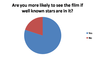
9) We considered using our own names as the actors/actresses but we thought he would seem more professional to include famous film star names in our film. So we asked the audience what they would prefer and got this result..
We found out that most people are more likely to see a film if well known actors are in it and this made us come to the conclusion that we would use Zoey Deschanel and Andrew Garfeild.

10) We decided to ask our audience what they would consider more important when advertising a film, whether it would be the teaser trailer, magazine reviews or the posters.
This made us realise how we should split our time between the three projects and spend more time creating the teaser trailer as that is what people are most interested in.

Tuesday, 7 December 2010

ROM-com Poster Research..


This romantic comedy poster is very typical and simple, by using the bright girly colours and bold writing to capture it's target audience of young women. Using a white background makes the information and image stand out and also helps to capture the audience. The name of the film and the billing block are both positioned at the top of the page, which is very unusual as they tend to appear at the bottom, causing this convention to be broken. The actors names are also at the top of the poster to grab attention to passers by, as these are well known actors/actresses they are quite large but not as big as the title as that is more important. In most ROM-com posters, the main characters are at the front of the poster to 'tell' the audience who the film revolves around and sometimes suggests the story. In this poster the female character is in the middle with the two male characters either side this suggests that some kind of war is going to take place between the two men to win the girl. The handwriting is a cute little touch on the poster which reminds the audience that the film is about the stories Bridget writes in her diary.


Made of Honor stays with the typical conventions by having the main male and female character in full focus on the poster, this automatically suggests that they are romantically involved or are going to be romantically involved. There isn't a large billing block on this film poster unlike the others and the the name of the film is at the top of the poster which is braking the convention of having the title at the bottom. Also the well-known actor's name is at the top, although this is typical it is unusual for there only to be one well-known name as usually both the male and female characters are played by popular actors/actresses. It also has a tag line underneath the title which we plan to do with our poster. The date of release is rather small at the bottom of the poster, this works well as it doesn't distract the view from the film title and for me this is the best poster of the three.


This film poster for romantic comedy "Never been kissed" is similar to the Bridget Jones poster as it uses the same colours to attract their target audience of young females. The have also to kept the colour scheme for the girl's clothes to keep the continuity in poster, much like the Bridget Jones poster also.  It is clear that this poster is to attract a younger audience as the actress is much younger and is posing as a younger female would which would suggest this poster is aimed at 16-24 year old females. Unlike the Bridget Jones poster the film name and billing block are at the bottom and side of the poster which is more common in film posters and therefore not braking this convention. The cast names are on the same side as the title and above it which I think takes away the grabbing effect of the title and therefore will not be doing that on our poster. 


From this research I can conclude that most posters have the white background so it doesn't overcome it's audience, as if the poster had a bright coloured background it was seem busy and people who have struggle to extract the important information like the film title and date of release. All the posters have a large image, which always includes the female lead character. We plan on including the main female and male characters on our poster and stick with the traditional layout of a film poster with the title at the bottom with the tag line underneath and include the actors/actresses somewhere on it.


Teaser Trailer Research..

We have decided that we're going to produce a ROM-com teaser trailer, so we have researched other ROM-com trailers to get an idea of what conventions we have to keep to and some that we could challenge.

Bridget Jones: The Edge of Reason (2004)
http://www.youtube.com/watch?v=1mC5mszSPGc
This film trailer starts with the media institution, in this case there are two- Universal and Working Title which only takes up 3 seconds of the 1:28 production. It then leads on to an office scene where we meet the main character 'Bridget' who is on the phone to a mystery guy who we do not meet until halfway through the conversation. The conversation is broken up between sentences with clips of phrases about Bridget, such as '70 shags', '6 glorious weeks' and '1 flawless boyfriend' which gives us an insight to her life. It then cuts to the mysterious man on the other end of the line, introducing him as another main character. Then it cuts to a white background where they introduce the characters as "he's back" and "she's back" with a montage of images of them both, this suggests that this film is a sequel, therefore having no need to name the actors as they are already known.

Never Been Kissed (1999)
http://www.youtube.com/watch?v=d97O5zOBwcw&playnext=1&list=PL46FB69CB2660C2BC&index=32
This film trailer also starts with the media institution- 20th Century Fox, with music and a voice over on top of the image. It then leads on to give us the basic outline of the story using quick cuts on different scenes using a montage. We understand from the footage that the lead character 'Josie' works as a journalist and is given the opportunity to go back to school undercover as a 17 year old to write an article. Josie was never in the popular crowd when she was younger and takes the advantage to make a new name for herself. She ends up falling in lover with her teacher and because he believes her to be 17, cannot let the relationship develop. The shots are broken up with title screens saying 'never been hip', 'never been cool' and 'never been sexy' these are read out by the voice over person, who also says 'in a story about getting a second chance to make a first impressioon' which creates the story in your mind before you have seen the film and also acts as a tag line, we would like to use this effect by using a voice over and a tag line in our trailer. The film title is shown twice with in between shots of her and then shows a title screen of bands/artists that are included on the soundtrack, which we don't often see in a film trailer and then it just simply says 'spring' for the release date which I think is effective but not very informative.

Made of Honor (2008)
http://www.youtube.com/watch?v=YVK9V8XGKXY&feature=related
This trailer is one minute long and only 2 seconds of it is made up of the institution title which in this case is Columbia. It immediately focuses on the main character - Tom who we gather is a popular guy from the montage of different scenes with his friends. The voice over says 'Tom has his guy friends', 'Tom has his girl friends' and 'Tom has his best friend' which is also displayed on the screen with clips of his friends in each situation. From the trailer we understand that the film revolves around Tom and his best friend Hannah. Tom is a ladies man, while she wants to get married but just hasn't found her perfect man. Whilst Tom is starting to think that he has fallen in love with Hannah, she announces that she's engaged and asks Tom to be her maid of honour. His friend persuades him to accept so he can attempt to stop the wedding and win her over. All the footage is shown in the form of a montage and at the end the title is shown is also read out but the voice over man.

From this research, I can conclude that most ROM-com teaser trailers start the trailer with the media institution sequence, which we intend on doing. Most of them also have a voice-over with music in the background and play their footage in the form of a montage, we have planned on trying to recreate this image. We have agreed on saving the title of our movie until the last few seconds of the trailer like the other teaser trailers that we have seen. This is so the name will be fresh in the viewers mind and will be less likely to forget it. What we haven't seen in these trailers is the actors/actresses names, we have discussed doing this in our production but haven't come to a firm conclusion.

Sunday, 5 December 2010

Storyline..

Firstly, we began to toy with the idea of trying to produce an action movie teaser trailer, after researching and discussing different ideas we settled on a romantic comedy idea. We have decided on the title - Imperfect Mr Perfect. We have started to throw around ideas and got a general storyline to base our trailer on.


Our story is about a single girl called Maria, who is looking for her perfect man. She is one of those girls who doesn't want to settle for just anybody and believe she deserves her prince charming. As she was brought up by parents with a very loving and strong relationship, she is desperate to find her own happy ending. After trying to find her perfect man she starts to wonder whether the so called 'Mr Perfect' actually exists. Her friends encourage her to go on a final date, which goes completely wrong and one the way home her car brakes down and is forced to take the bus ride home. Whilst waiting at the bus stop a careless bike rider gets distracted by Maria and loses focus on the road and crashes his bike. Maria, who is weirdly finds the bike rider impressive and helps him back on his feet. This is a perfect incident of 'love at first sight' and they hit it off straight away. This reckless bike driver is no where near her idea of perfect and she shocks her friends and parents with her new lover. Maria has definitely found her Imperfect Mr Perfect ;)